Table of contents
- 1. Introduction to Biochemistry4h 36m
- What is Biochemistry?7m
- Characteristics of Life12m
- Abiogenesis13m
- Nucleic Acids16m
- Proteins12m
- Carbohydrates8m
- Lipids10m
- Taxonomy10m
- Cell Organelles12m
- Endosymbiotic Theory11m
- Central Dogma22m
- Functional Groups15m
- Chemical Bonds13m
- Organic Chemistry31m
- Entropy17m
- Second Law of Thermodynamics11m
- Equilibrium Constant10m
- Gibbs Free Energy37m
- 2. Water3h 23m
- 3. Amino Acids8h 10m
- Amino Acid Groups8m
- Amino Acid Three Letter Code13m
- Amino Acid One Letter Code37m
- Amino Acid Configuration20m
- Essential Amino Acids14m
- Nonpolar Amino Acids21m
- Aromatic Amino Acids14m
- Polar Amino Acids16m
- Charged Amino Acids40m
- How to Memorize Amino Acids1h 7m
- Zwitterion33m
- Non-Ionizable Vs. Ionizable R-Groups11m
- Isoelectric Point10m
- Isoelectric Point of Amino Acids with Ionizable R-Groups51m
- Titrations of Amino Acids with Non-Ionizable R-Groups44m
- Titrations of Amino Acids with Ionizable R-Groups38m
- Amino Acids and Henderson-Hasselbalch44m
- 4. Protein Structure10h 4m
- Peptide Bond18m
- Primary Structure of Protein31m
- Altering Primary Protein Structure15m
- Drawing a Peptide44m
- Determining Net Charge of a Peptide42m
- Isoelectric Point of a Peptide37m
- Approximating Protein Mass7m
- Peptide Group22m
- Ramachandran Plot26m
- Atypical Ramachandran Plots12m
- Alpha Helix15m
- Alpha Helix Pitch and Rise20m
- Alpha Helix Hydrogen Bonding24m
- Alpha Helix Disruption23m
- Beta Strand12m
- Beta Sheet12m
- Antiparallel and Parallel Beta Sheets39m
- Beta Turns26m
- Tertiary Structure of Protein16m
- Protein Motifs and Domains23m
- Denaturation14m
- Anfinsen Experiment20m
- Protein Folding34m
- Chaperone Proteins19m
- Prions4m
- Quaternary Structure15m
- Simple Vs. Conjugated Proteins10m
- Fibrous and Globular Proteins11m
- 5. Protein Techniques14h 5m
- Protein Purification7m
- Protein Extraction5m
- Differential Centrifugation15m
- Salting Out18m
- Dialysis9m
- Column Chromatography11m
- Ion-Exchange Chromatography35m
- Anion-Exchange Chromatography38m
- Size Exclusion Chromatography28m
- Affinity Chromatography16m
- Specific Activity16m
- HPLC29m
- Spectrophotometry51m
- Native Gel Electrophoresis23m
- SDS-PAGE34m
- SDS-PAGE Strategies16m
- Isoelectric Focusing17m
- 2D-Electrophoresis23m
- Diagonal Electrophoresis29m
- Mass Spectrometry12m
- Mass Spectrum47m
- Tandem Mass Spectrometry16m
- Peptide Mass Fingerprinting16m
- Overview of Direct Protein Sequencing30m
- Amino Acid Hydrolysis10m
- FDNB26m
- Chemical Cleavage of Bonds29m
- Peptidases1h 6m
- Edman Degradation30m
- Edman Degradation Sequenator and Sequencing Data Analysis4m
- Edman Degradation Reaction Efficiency20m
- Ordering Cleaved Fragments21m
- Strategy for Ordering Cleaved Fragments58m
- Indirect Protein Sequencing Via Geneomic Analyses24m
- 6. Enzymes and Enzyme Kinetics13h 38m
- Enzymes24m
- Enzyme-Substrate Complex17m
- Lock and Key Vs. Induced Fit Models23m
- Optimal Enzyme Conditions9m
- Activation Energy24m
- Types of Enzymes41m
- Cofactor15m
- Catalysis19m
- Electrostatic and Metal Ion Catalysis11m
- Covalent Catalysis18m
- Reaction Rate10m
- Enzyme Kinetics24m
- Rate Constants and Rate Law35m
- Reaction Orders52m
- Rate Constant Units11m
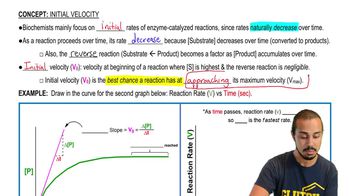
- Initial Velocity31m
- Vmax Enzyme27m
- Km Enzyme42m
- Steady-State Conditions25m
- Michaelis-Menten Assumptions18m
- Michaelis-Menten Equation52m
- Lineweaver-Burk Plot43m
- Michaelis-Menten vs. Lineweaver-Burk Plots20m
- Shifting Lineweaver-Burk Plots37m
- Calculating Vmax40m
- Calculating Km31m
- Kcat46m
- Specificity Constant1h 1m
- 7. Enzyme Inhibition and Regulation 8h 42m
- Enzyme Inhibition13m
- Irreversible Inhibition12m
- Reversible Inhibition9m
- Inhibition Constant26m
- Degree of Inhibition15m
- Apparent Km and Vmax29m
- Inhibition Effects on Reaction Rate10m
- Competitive Inhibition52m
- Uncompetitive Inhibition33m
- Mixed Inhibition40m
- Noncompetitive Inhibition26m
- Recap of Reversible Inhibition37m
- Allosteric Regulation7m
- Allosteric Kinetics17m
- Allosteric Enzyme Conformations33m
- Allosteric Effectors18m
- Concerted (MWC) Model25m
- Sequential (KNF) Model20m
- Negative Feedback13m
- Positive Feedback15m
- Post Translational Modification14m
- Ubiquitination19m
- Phosphorylation16m
- Zymogens13m
- 8. Protein Function 9h 41m
- Introduction to Protein-Ligand Interactions15m
- Protein-Ligand Equilibrium Constants22m
- Protein-Ligand Fractional Saturation32m
- Myoglobin vs. Hemoglobin27m
- Heme Prosthetic Group31m
- Hemoglobin Cooperativity23m
- Hill Equation21m
- Hill Plot42m
- Hemoglobin Binding in Tissues & Lungs31m
- Hemoglobin Carbonation & Protonation19m
- Bohr Effect23m
- BPG Regulation of Hemoglobin24m
- Fetal Hemoglobin6m
- Sickle Cell Anemia24m
- Chymotrypsin18m
- Chymotrypsin's Catalytic Mechanism38m
- Glycogen Phosphorylase21m
- Liver vs Muscle Glycogen Phosphorylase21m
- Antibody35m
- ELISA15m
- Motor Proteins14m
- Skeletal Muscle Anatomy22m
- Skeletal Muscle Contraction45m
- 9. Carbohydrates7h 49m
- Carbohydrates19m
- Monosaccharides15m
- Stereochemistry of Monosaccharides33m
- Monosaccharide Configurations32m
- Cyclic Monosaccharides20m
- Hemiacetal vs. Hemiketal19m
- Anomer14m
- Mutarotation13m
- Pyranose Conformations23m
- Common Monosaccharides33m
- Derivatives of Monosaccharides21m
- Reducing Sugars21m
- Reducing Sugars Tests19m
- Glycosidic Bond48m
- Disaccharides40m
- Glycoconjugates12m
- Polysaccharide7m
- Cellulose7m
- Chitin8m
- Peptidoglycan12m
- Starch13m
- Glycogen14m
- Lectins16m
- 10. Lipids5h 49m
- Lipids15m
- Fatty Acids30m
- Fatty Acid Nomenclature11m
- Omega-3 Fatty Acids12m
- Triacylglycerols11m
- Glycerophospholipids24m
- Sphingolipids13m
- Sphingophospholipids8m
- Sphingoglycolipids12m
- Sphingolipid Recap22m
- Waxes5m
- Eicosanoids19m
- Isoprenoids9m
- Steroids14m
- Steroid Hormones11m
- Lipid Vitamins19m
- Comprehensive Final Lipid Map13m
- Biological Membranes16m
- Physical Properties of Biological Membranes18m
- Types of Membrane Proteins8m
- Integral Membrane Proteins16m
- Peripheral Membrane Proteins12m
- Lipid-Linked Membrane Proteins21m
- 11. Biological Membranes and Transport 6h 37m
- Biological Membrane Transport21m
- Passive vs. Active Transport18m
- Passive Membrane Transport21m
- Facilitated Diffusion8m
- Erythrocyte Facilitated Transporter Models30m
- Membrane Transport of Ions29m
- Primary Active Membrane Transport15m
- Sodium-Potassium Ion Pump20m
- SERCA: Calcium Ion Pump10m
- ABC Transporters12m
- Secondary Active Membrane Transport12m
- Glucose Active Symporter Model19m
- Endocytosis & Exocytosis18m
- Neurotransmitter Release23m
- Summary of Membrane Transport21m
- Thermodynamics of Membrane Diffusion: Uncharged Molecule51m
- Thermodynamics of Membrane Diffusion: Charged Ion1h 1m
- 12. Biosignaling9h 45m
- Introduction to Biosignaling44m
- G protein-Coupled Receptors32m
- Stimulatory Adenylate Cyclase GPCR Signaling42m
- cAMP & PKA28m
- Inhibitory Adenylate Cyclase GPCR Signaling29m
- Drugs & Toxins Affecting GPCR Signaling20m
- Recap of Adenylate Cyclase GPCR Signaling5m
- Phosphoinositide GPCR Signaling58m
- PSP Secondary Messengers & PKC27m
- Recap of Phosphoinositide Signaling7m
- Receptor Tyrosine Kinases26m
- Insulin28m
- Insulin Receptor23m
- Insulin Signaling on Glucose Metabolism57m
- Recap Of Insulin Signaling in Glucose Metabolism6m
- Insulin Signaling as a Growth Factor1h 1m
- Recap of Insulin Signaling As A Growth Factor9m
- Recap of Insulin Signaling1m
- Jak-Stat Signaling25m
- Lipid Hormone Signaling15m
- Summary of Biosignaling13m
- Signaling Defects & Cancer20m
- Review 1: Nucleic Acids, Lipids, & Membranes2h 47m
- Nucleic Acids 19m
- Nucleic Acids 211m
- Nucleic Acids 34m
- Nucleic Acids 44m
- DNA Sequencing 19m
- DNA Sequencing 211m
- Lipids 111m
- Lipids 24m
- Membrane Structure 110m
- Membrane Structure 29m
- Membrane Transport 18m
- Membrane Transport 24m
- Membrane Transport 36m
- Practice - Nucleic Acids 111m
- Practice - Nucleic Acids 23m
- Practice - Nucleic Acids 39m
- Lipids11m
- Practice - Membrane Structure 17m
- Practice - Membrane Structure 25m
- Practice - Membrane Transport 16m
- Practice - Membrane Transport 26m
- Review 2: Biosignaling, Glycolysis, Gluconeogenesis, & PP-Pathway3h 12m
- Biosignaling 19m
- Biosignaling 219m
- Biosignaling 311m
- Biosignaling 49m
- Glycolysis 17m
- Glycolysis 27m
- Glycolysis 38m
- Glycolysis 410m
- Fermentation6m
- Gluconeogenesis 18m
- Gluconeogenesis 27m
- Pentose Phosphate Pathway15m
- Practice - Biosignaling13m
- Practice - Bioenergetics 110m
- Practice - Bioenergetics 216m
- Practice - Glycolysis 111m
- Practice - Glycolysis 27m
- Practice - Gluconeogenesis5m
- Practice - Pentose Phosphate Path6m
- Review 3: Pyruvate & Fatty Acid Oxidation, Citric Acid Cycle, & Glycogen Metabolism2h 26m
- Pyruvate Oxidation9m
- Citric Acid Cycle 114m
- Citric Acid Cycle 27m
- Citric Acid Cycle 37m
- Citric Acid Cycle 411m
- Metabolic Regulation 18m
- Metabolic Regulation 213m
- Glycogen Metabolism 16m
- Glycogen Metabolism 28m
- Fatty Acid Oxidation 111m
- Fatty Acid Oxidation 28m
- Citric Acid Cycle Practice 17m
- Citric Acid Cycle Practice 26m
- Citric Acid Cycle Practice 32m
- Glucose and Glycogen Regulation Practice 14m
- Glucose and Glycogen Regulation Practice 26m
- Fatty Acid Oxidation Practice 14m
- Fatty Acid Oxidation Practice 27m
- Review 4: Amino Acid Oxidation, Oxidative Phosphorylation, & Photophosphorylation1h 48m
- Amino Acid Oxidation 15m
- Amino Acid Oxidation 211m
- Oxidative Phosphorylation 18m
- Oxidative Phosphorylation 210m
- Oxidative Phosphorylation 310m
- Oxidative Phosphorylation 47m
- Photophosphorylation 15m
- Photophosphorylation 29m
- Photophosphorylation 310m
- Practice: Amino Acid Oxidation 12m
- Practice: Amino Acid Oxidation 22m
- Practice: Oxidative Phosphorylation 15m
- Practice: Oxidative Phosphorylation 24m
- Practice: Oxidative Phosphorylation 35m
- Practice: Photophosphorylation 15m
- Practice: Photophosphorylation 21m
6. Enzymes and Enzyme Kinetics
Initial Velocity
Struggling with Biochemistry?
Join thousands of students who trust us to help them ace their exams!Watch the first video
Initial Velocity
Jason Amores Sumpter
Video duration:
9mPlay a video:
Related Videos
Related Practice
 08:16
08:16