This video, we're going to briefly introduce population demography. And so demography can be defined as the statistical analysis or study of population characteristics and trends, including looking at population size, structure, and distribution, and also looking at the processes that drive population changes, such as birth rates, death rates, and even migration patterns. Now aspects of demographic information can be summarized in what are known as life tables and what are known as survivorship curves. Now moving forward, we're going to discuss each of these in their own separate videos starting with the life tables. So I'll see you all there.
- 1. Introduction to Biology2h 40m
- 2. Chemistry3h 40m
- 3. Water1h 26m
- 4. Biomolecules2h 23m
- 5. Cell Components2h 26m
- 6. The Membrane2h 31m
- 7. Energy and Metabolism2h 0m
- 8. Respiration2h 40m
- 9. Photosynthesis2h 49m
- 10. Cell Signaling59m
- 11. Cell Division2h 47m
- 12. Meiosis2h 0m
- 13. Mendelian Genetics4h 41m
- Introduction to Mendel's Experiments7m
- Genotype vs. Phenotype17m
- Punnett Squares13m
- Mendel's Experiments26m
- Mendel's Laws18m
- Monohybrid Crosses16m
- Test Crosses14m
- Dihybrid Crosses20m
- Punnett Square Probability26m
- Incomplete Dominance vs. Codominance20m
- Epistasis7m
- Non-Mendelian Genetics12m
- Pedigrees6m
- Autosomal Inheritance21m
- Sex-Linked Inheritance43m
- X-Inactivation9m
- 14. DNA Synthesis2h 27m
- 15. Gene Expression3h 20m
- 16. Regulation of Expression3h 31m
- Introduction to Regulation of Gene Expression13m
- Prokaryotic Gene Regulation via Operons27m
- The Lac Operon21m
- Glucose's Impact on Lac Operon25m
- The Trp Operon20m
- Review of the Lac Operon & Trp Operon11m
- Introduction to Eukaryotic Gene Regulation9m
- Eukaryotic Chromatin Modifications16m
- Eukaryotic Transcriptional Control22m
- Eukaryotic Post-Transcriptional Regulation28m
- Eukaryotic Post-Translational Regulation13m
- 17. Viruses37m
- 18. Biotechnology2h 58m
- 19. Genomics17m
- 20. Development1h 5m
- 21. Evolution3h 1m
- 22. Evolution of Populations3h 52m
- 23. Speciation1h 37m
- 24. History of Life on Earth2h 6m
- 25. Phylogeny40m
- 26. Prokaryotes1h 5m
- 27. Protists1h 6m
- 28. Plants1h 22m
- 29. Fungi36m
- 30. Overview of Animals34m
- 31. Invertebrates1h 2m
- 32. Vertebrates50m
- 33. Plant Anatomy1h 3m
- 34. Vascular Plant Transport2m
- 35. Soil37m
- 36. Plant Reproduction47m
- 37. Plant Sensation and Response1h 9m
- 38. Animal Form and Function1h 19m
- 39. Digestive System10m
- 40. Circulatory System1h 57m
- 41. Immune System1h 12m
- 42. Osmoregulation and Excretion50m
- 43. Endocrine System4m
- 44. Animal Reproduction2m
- 45. Nervous System55m
- 46. Sensory Systems46m
- 47. Muscle Systems23m
- 48. Ecology3h 11m
- Introduction to Ecology20m
- Biogeography14m
- Earth's Climate Patterns50m
- Introduction to Terrestrial Biomes10m
- Terrestrial Biomes: Near Equator13m
- Terrestrial Biomes: Temperate Regions10m
- Terrestrial Biomes: Northern Regions15m
- Introduction to Aquatic Biomes27m
- Freshwater Aquatic Biomes14m
- Marine Aquatic Biomes13m
- 49. Animal Behavior28m
- 50. Population Ecology3h 41m
- Introduction to Population Ecology28m
- Population Sampling Methods23m
- Life History12m
- Population Demography17m
- Factors Limiting Population Growth14m
- Introduction to Population Growth Models22m
- Linear Population Growth6m
- Exponential Population Growth29m
- Logistic Population Growth32m
- r/K Selection10m
- The Human Population22m
- 51. Community Ecology2h 46m
- Introduction to Community Ecology2m
- Introduction to Community Interactions9m
- Community Interactions: Competition (-/-)38m
- Community Interactions: Exploitation (+/-)23m
- Community Interactions: Mutualism (+/+) & Commensalism (+/0)9m
- Community Structure35m
- Community Dynamics26m
- Geographic Impact on Communities21m
- 52. Ecosystems28m
- 53. Conservation Biology24m
Population Demography - Online Tutor, Practice Problems & Exam Prep
Demography is the statistical study of population characteristics, including size, structure, and distribution, influenced by birth rates, death rates, and migration. Life tables summarize demographic data, focusing on a cohort's survivorship, mortality, and reproductive rates, often emphasizing females in sexually reproducing species. Survivorship curves graphically represent life tables, illustrating three types: type 1 (low early mortality), type 2 (constant mortality), and type 3 (high early mortality). Understanding these concepts is crucial for analyzing population dynamics and ecological interactions.
Population Demography
Video transcript
Life Tables
Video transcript
This video, we're going to talk about life tables and how they display aspects of demographic information. A life table is really just a comprehensive statistical table that shows a population's survivorship and mortality and reproductive rates of a cohort. A cohort is defined as a group of same species individuals born into a population right around the same time, and so they're all about the same age. Life tables often only include data on females when they're looking at sexually reproducing organisms, since only females produce offspring, and therefore, females tend to have a greater impact on population dynamics in comparison to males. Notice down below, we're showing you an example of a life table for female fruit flies, Drosophila melanogaster.
In this life table, it's analyzing a cohort of 500 female fruit flies that are all about the same age, between 0 to 10 days of age. It analyzes and follows these fruit flies through time until all of these fruit flies are dead. Along the way, it collects and gathers all of the statistical data that you can see here in this table. It is important for you to be able to understand life tables, so let me walk you through it a little bit. Notice on the far left, we have the age interval in days, then we have the number of organisms alive at the start of the age interval, then we have the overall survivorship at the start of the interval or the proportion of organisms that are still alive at the start of that age interval, then we have the overall mortality rate or the overall death rate between age intervals, and then we have the fecundity or the capacity for the organisms to reproduce.
Here in this specific scenario, we're showing you the average number of female offspring per female, and so let me slide out of the way so that you can see these numbers here. Now what we're going to do now is fill in these interactive blanks throughout this table, so that you can again better understand this table and how the values are collected. Here we're looking at the mortality rate of this specific age group between 0 to 10 days. What we need to realize is that initially, there were 500 of these female Drosophila fruit flies, but then in the next age interval, there were only 366, which means that 134 of them died. If you calculate 134500, what you get is an answer of 0.268, or in other words, 26.8% of the 500 organisms died in this age interval.
Next, what we have over here is the survivorship at the start of the age interval 20 to 30 days, and so what we need to realize is that there are 280 organisms still alive at the start of this age interval, and so if you calculate 280500, the initial number, what you get is an answer of 0.560, or in other words, 56% of all the organisms that started are still alive at the start of this age interval, 20 to 30 days. Last but not least, we have this blank here, which is going to be the number of organisms alive at the start of this 30 to 40 day interval. Notice that the survivorship is 0.248, or in other words, 24.8 percent of the initial number of organisms are still alive here. If you calculate 0.248500, what you get is an answer of 124, and that is the number of organisms alive at the start of this 30 to 40 day interval. Really, that's all there is to these life tables.
Moving forward, we'll be able to get some practice applying these concepts, and I'll see you all there.
Which of the following statements about life tables is true?
Life tables usually only consider males in the population because they typically survive the longest.
Life tables provide detailed information on a population’s birth & death rates but not survivorship data.
Life tables can be used to estimate future population size by examining age-specific mortality/fecundity rates.
Life tables never include data on males in the population.
Life tables are exclusively used for studying human populations and are not applicable to other species.
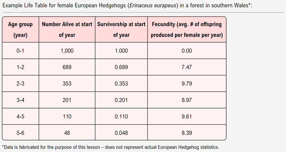
Based on the data in this life table, at what age do female European hedgehogs reach sexual maturity and become capable of sexual reproduction?
0-1 years.
1-2 years.
2-3 years.
3-4 years.
If a cohort of female European Hedgehogs has a starting population of 2,500 and a survivorship of 0.343 after 2 years, how many hedgehogs make it to 2 years old?
883.
503.
1723.
353.
Survivorship Curves
Video transcript
This video, we're going to talk about the demographic information in survivorship curves. A survivorship curve is really just a graphical representation of a life table, and it is a graph of the number of living individuals in a cohort, which we plot on the y-axis of the curve, surviving to each age group, which we plot on the x-axis of the curve. Now the y-axis of a survivorship curve is often expressed on a logarithmic scale, which is important because it allows for a wide range of values to be plotted onto the same graph. There are only 3 general shapes of survivorship curves, which we call type 1, type 2, and type 3 survivorship curves, and we can see them down below in this graph. Notice that the blue curve that we're showing you here represents a type 1 survivorship curve.
In a type 1 survivorship curve, there is very low mortality rates early on in life, allowing most individuals that are born to survive to adulthood. But then later in life, the mortality rates increase significantly. An example of a species that exhibits a type 1 survivorship curve is human beings like you and me. A type 2 survivorship curve is being shown here in red. Instead of having low and then high mortality rates, with a type 2 survivorship curve, the mortality rates are pretty similar throughout the entire species' lifetime, creating a straight line as you can see here.
An example of a species that displays a type 2 survivorship curve is the northern cardinal that you can see here. Lastly, we have a type 3 survivorship curve, which is essentially the opposite of a type 1 survivorship curve. Instead of having very low mortality rates early in life, there are very high mortality rates early in life, and so most individuals that are born will not survive to adulthood. But then once the individuals reach a certain age, the mortality rates decrease significantly, and very few of them can actually reach adulthood and, you know, older ages of life. An example of a species that displays a type 3 survivorship curve is the American bullfrog that you can see here.
Down below, we do have a very important note, which is that survivorship is actually a spectrum, and so most populations actually exhibit characteristics that fall somewhat in between these three classic types, type 1, type 2, and type 3. These are just very recognizable survivorship curves. But, again, species in reality can display all kinds of different shapes, and so they can fall in between these values. This here concludes our lesson on survivorship curves, and we'll be able to get some practice moving forward. I'll see you in our next video.
Population Demography Example 1
Video transcript
So here we have an example problem that asks, which of the following 5 species that you can see listed below exhibits a type 2 survivorship curve? And we've got these 4 potential answer options down below. Now, of course, recall from our last lesson video that a type 2 survivorship curve is when there is a similar mortality rate throughout the entire lifetime of the species. With that in mind, notice that option one says oak trees produce thousands of acorns, very few of which grow into mature oak trees. This suggests a really high mortality rate early in life, consistent with a type 3 survivorship curve.
Now, notice number 2 says rats do not have a significantly higher death rate at any specific age, which suggests very similar mortality rates throughout the entire lifetimes of this rat species. This is going to correspond with a type 2 survivorship curve. Now, number 3 says, humans living in the USA. We know that humans have a very low mortality rate early in life and higher mortality rates later in life, consistent with a type 1 survivorship curve. Next, we have number 4, which says frogs produce hundreds of tadpoles, most of whom cannot avoid predation or starvation.
This again suggests a really high mortality rate early in life, consistent with a type 3 survivorship curve. And then last but not least, number 5 says wrens, small songbirds that have approximately an equal chance of dying throughout their lifespan. This also suggests a similar mortality rate throughout their entire lifetime, so that's consistent with a type 2 survivorship curve. Notice that it's only 2 and 5 here that correspond with type 2 survivorship curves and that corresponds with answer option d which says 25. So what we can indicate is that d here is the correct answer to this example problem, and that concludes this example.
So I'll see you all in our next video.
A carp has many offspring at once, but the majority of them are eaten by predators in their first year of life. As carp develop & grow, they have fewer predators in later life. Which survivorship curve do carp exhibit?
Type I.
Type II.
Type III.
Impossible to tell.
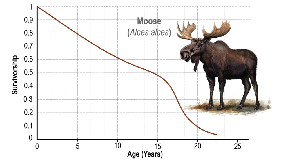
Based on the following survivorship curve for moose, how many moose in an initial cohort of 3,500 individuals would you expect to survive to age 20?
100 moose.
350 moose.
35 moose.
Impossible to tell.