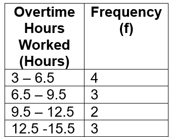
So we talked a lot about how we can use different types of charts and graphs with their own strengths and weaknesses to visualize different types of data, whether it's qualitative or quantitative. But one of the very first things you'll have to do before you do any of that is organize your information and data into what's called a frequency distribution. I know that sounds like a scary word, but don't worry because what I'm going to show you in this video is that all this is is it's just a table. It's a table that helps you organize the frequency, the number of measurements that you have, versus different groups of numbers or labels. So let's go ahead and dive right in.
We're going to do an example together. I'll show you some definitions that you need to know, and we'll do some examples. Let's get started. Frequency distribution is just a table. It's a table of values, and it shows the frequency, remember the number of measurements over here in this column, versus chosen groups of numbers or labels.
These are things that are called classes. So, for example, in this example problem, we have this dataset which lists the amount of time in minutes that students spend studying for their exam, and it's listed over here. We're going to construct a frequency distribution using 6 evenly spaced classes. So, what does that mean? Well, basically, what happens is we have this table of values over here, and these 6 evenly spaced classes are where we see values from 20 to 29, 30 to 39, and so on and so forth.
These are all evenly spaced, and there are 6 of them if you scroll down. So, basically, these things over here are called your classes. In some cases, like this example, the groups are chosen for you. And in other cases, you'll have to come up with them yourself, and we'll see how to do that later on. But all that I'm going to do here is we're going to look through the data values.
And in order to figure out the frequency, the number of measurements, I just have to go figure out how many measurements belong in each one of these classes. So let's go ahead and do that. I'm going to look through my dataset over here. I see numbers that go from 20 all the way up to 75. What I'd like to do is just look through each one of them over here.
I've got my classes over here. And for the 20 to 29 range, all I have to do is just figure out how many of these things belong in that category. If I look through the number I see first is 20, so one of the things I like to do is either tally them or, or cross them out just so I don't double count them later on. It's going to be really helpful when you get, you know, bigger datasets of 20, let's say, numbers. So 20, I've counted that once.
I'm going to put a tally there. Then I count my thirties, 30 to 39. I've got 2 over here. That's 1, 2. I got my forties. That's 1, 2, and 3. That's 3. And I got my fifties. That's 2. And I got my sixties. That's 1. And then my seventies. That's 1. So now I'm done with all of these things, and I'm just going to replace these tally marks with numbers. So this is a 1 over here. This is a 2. This is a 3, 2. And then we got 1 and 1. Alright? So that is a frequency distribution.
We've got my classes over here, and then you've got my frequency over here. That's really all there is to it. Okay? So now a couple of definitions here because you'll notice that each one of these classes has an interval of numbers, 20 to 29. The lower class limit, which you'll need to know, is basically just the lowest of each one of those numbers, of each one of those classes.
So in this case, the lowest numbers are 20, 30, 40. Basically, it's just all of the left numbers in this column. So the lower class limit is 20, 30, 40, so on and so forth. Alright? Now if that's the lower class limit, what do you think the upper class limit is?
Well, hopefully, you realize that those are going to be the highest numbers. So in other words, those are just going to be the 29, 39, 49, so on and so forth. So these are going to be your upper class limits. Alright? So we've got 29, 39, and then so on and so forth.
Alright? So now something that you may have to know in these problems is not the lowest and highest numbers of each class, but what's the midpoint. And, essentially, that is just the middle number in each class. Now, most of the time, you'll have to calculate these, but it's actually pretty simple to calculate. All you just do is you take the average of the two numbers. In other words, you just take the lower of each class and the upper and then just divide by 2. An example of this would be for the first one to calculate the class midpoint, it would just be 20 +29 / 2, and that would give you 24.5. And then so on and so forth. You could calculate them for the rest of them. Alright.
So that's the class midpoint. And the very last thing, the very last definition you'll need to know is something called the class width. So the class width is essentially the difference between 2 consecutive, and that's the most important word there, consecutive lower or upper class limits. So be really careful here. Right?
The interval of this one class goes from 20 to 29, but the difference between a consecutive lower class is from 20 to 30. So in other words, it's basically the class width is 30 minus 20, which is 10. Or another way you could calculate this is just doing the upper class limits, 39 minus 29, in which you'll just get the same exact number. It's 10. So the class width for this dataset over here is 10, not 9.
So what you don't want to do is you don't want to do the upper minus the lower because that's going to give you 9. That's not what the class width is. If you do that, you're going to get the wrong answer. So just be very, very careful with this. The reason for this, by the way, is that if this was actually 30, then if you were to get a number of 30, you'd have to put it into both of these classes over here, so you'd have to double count them.
And that's why these things are always basically just, separated by at least one number here. So 20 to 29, and then the next one starts at 30, not 29. Okay? Alright. So that's it for the definitions over here.
The class width is 10. So now what I want to do is just talk about the relative frequency distribution because that was actually the other part of the problem here. So we figured out the frequency distribution. One of the things you may also have to do is calculate something called the relative frequencies of each. And, basically, the relative frequency is essentially just you're just going to show those frequencies as percents of a total number.
That total number of measurements that you have in your dataset is a variable. It's called n. So if you look through this dataset over here, what we have is that n is equal to 10. That's going to be a really important variable that we'll talk about later on. So essentially, all you have to do to calculate the relative frequencies is just take f divided by n.
That's going to turn into a decimal, then you multiply by 100 to turn into a percent. So in other words, this is going to be 1 divided by 10, which is going to be 0.1. And then if you turn it if you multiply it by 100, what you're going to get is 10 percent. And if you do the same exact thing over here, you're going to get 2 over 10, which ends up getting you 20%. And then you'll do the same thing, 3 over 10, that'll give you 30%, so on and so forth.
You just do the same thing throughout all. You're going to get, either you can express these as decimals or percentages. Either way, usually, they're decimals. This is going to be 10% and then 10%. Alright.
That just gives you sort of a relative percentage of the total number of measurements there. So that's it for a frequency distribution. Hopefully, that made sense. Let's go ahead and take a look at some practice.