So we've talked about Consumer Surplus, now let's talk about the other side of the coin, Producer Surplus, right? Maybe you found something lying around the house that you're like, hey, if I could sell this on eBay for $5, that'd be awesome. Right? And you put it on eBay, it ends up being a collector's item and it sells for $50. You would have sold it for $5 right? Hey, so you've had some producer surplus. Let's dive in. Alright, so you're going to see a lot of parallels here between what we do here and what we did with consumer surplus. It's just a lot of it's kind of the other way around. So when we talked about willingness to pay right, that was the maximum that someone was willing to pay, a consumer was willing to pay. Well, willingness to sell is going to represent the minimum price for one of the suppliers to sell their thing, right? So the minimum price is the willingness to sell and we're just going to see just like the demand curve represented the willingness to pay, we've got the supply curve is going to represent our willingness to sell. Okay. So, surplus. We're talking about producer surplus, but surplus is still good deals, right? We're talking about the good deals. We're now just talking about good deals for the producer, right? So this is when they're willing to sell for less than the market price, right? And when we talk about this willingness to sell, right, everyone's kind of going to have a different willingness to sell. You could maybe think about maybe this company that produces teddy bears, right, and they produce them, you know, maybe they're willing to sell them for $10 and the market price is $20 right, and they have some surplus there, but you have your teddy bear at home, you know, your teddy bear, that teddy bear and you're not going to have that same willingness to sell, right? You probably wouldn't get rid of your teddy bear for $10 right? That teddy bear's got some serious emotional value in there that's going to bring that willingness to sell way up. Alright, so that's kind of willingness to sell is going to be different for each supplier and that's where we're going to get this producer surplus where we get the market price minus that willingness to sell, alright? And just like the willingness to pay, our demand curve represented marginal benefit, the willingness to sell and our supply curve is going to represent our marginal cost to society. Okay. So the idea here is you know that company is willing to sell those teddy bears for $10 right, but the market price is $20 for a teddy bear, the marginal cost is still going to be that $10 that they're willing to sell it at, right? Because they would have got rid of it at 10, they're just getting that surplus, that extra money, so the idea here not to over complicate is that that supply curve is going to represent our marginal cost. Okay, so let's go ahead and do just like we did with consumer surplus, let's do a small setting example of producer surplus here. So I've got 4 names I picked at random right? Bart, Lisa, Marge, and Homer and they're going to be producers in this market and just like before, we're going to have only one thing per person, right? They're not going to be selling multiple units. Each person is just going to sell 1. They each have one of this. Maybe it's that golden cheesy poof, right? They each have one to sell, and let's go ahead and draw their supply curve in this small market. So let's start with Homer, right? When the price is low, Homer's going to be the only one that sells. So at a price of $2, Homer is the only one getting in the market, and there will be one supplied. How about when the price rises to $4? Now Homer will sell, but also Marge. So we'll have 2 supplied at a price of $4. Same thing here at a price of $6, you'll see Lisa get in the market. So 3 will be supplied, and finally, everybody sells when the price is at least 8 dollars right? So let's go ahead and drive or draw our supply curve and remember we're not going to get that straight line because we're still in a small setting. We're going to get that jagged kind of supply curve until we have a lot more sellers. Right? So in this small market, we're going to have this shape. Right? And we draw it this way because it makes sense. If the price was $3 or something, you can always double-check right. At this price of $3, the quantity is 1 which is still correct right because Homer is the only one who sells at a price of $3 so the quantity should still be 1 there. Alright, so let's go ahead and calculate producer surplus at different price levels. I'm going to get out of the way here. We're going to start with the low price of $4 and then raise the price to see how as the price increases, the producer surpl
Producer Surplus and Willingness to Sell - Online Tutor, Practice Problems & Exam Prep
Producer Surplus in a Small Setting
Video transcript
Producer Surplus and Market Supply
Video transcript
Alright. So now let's extend that idea of producer surplus to the entire market. So like we see here in the green box, we've got the area below the market price, right, and above the supply curve. That's going to be our producer surplus just like we kind of saw in the examples in the small market. We're going to see it going on here. So let's start with this original producer surplus before we change the price. So we've got our price axis here, our quantity axis, and say that there's this price on the market, right, whatever the market price is and we're going to supply this quantity at that price. Right? And notice that now we've got our smooth supply curve. It's no longer that jagged curve that we saw before and this is because there are a lot of suppliers now. Right? Before we had, you know, Homer supplying at $2, Mark at $4. Well, now there are suppliers that will supply at $3 at $3.5 right? All the willingness to sell, of all these multitude of suppliers now and that's going to smooth out our curve and give us this straight line, and we got that upward supply, right? We had that downward demand, supply is the other one that goes upwards. Cool. So at this price p, what is our producer surplus? Well, it's going to be that area below the market price and above the supply curve. So I'm going to highlight it here in this purple. Right? And you see that we get a triangle again. Right? We've got this triangle, and we could, right, theoretically get the area of this triangle if we had the right information, right, we'd need some information about what that quantity is, we'd have our base and our height, right, And we could figure out what that producer surplus is. We might need this number right here too. What's that minimum supply? Well anyways, let's go ahead and see what happens when we decrease the price, right? So when you decrease the price, what would you expect to happen to producer surplus? Would you expect producer surplus to increase or decrease? Well, the idea is that it's going to decrease, right? It's going to decrease because fewer people are willing to sell at a lower price. It goes back to that law of supply, lower price, fewer people supplying, less quantity supplied. So let's go ahead and see what happens here to our producer surplus. So right, we had that original price, P, but let's say we were at this low price. We'll say PL again. PLow. L for low. Right? So our original surplus for the producers was this whole purple area just like we had on the other side, right? That whole triangle, I'm going to get rid of it and let's go ahead and highlight our new producer surplus in purple, right. So we expected it to decrease, we've got this low price of PL and it's going to be everything below the market price and above the supply curve. So we're going to get this little baby area right there is going to be our remaining producer surplus after the price decrease. So what happened to our Producer Surplus? Where did it go? Well first we're going to see that producers that are still selling, right, they're still selling at this lower price because the lower price is still above their willingness to sell or equal to their willingness to sell, they're still going to sell but they're going to lose surplus because the price dropped and that's represented by this green area right here. That green rectangle represents the surplus lost to the suppliers that are still in the market. Right? And just like with consumer surplus, the price change is going to drop these producers out of the market. Right? So this blue triangle represents suppliers that were selling at the higher price, but now that the price has decreased, their willingness to sell is above that price and they are no longer going to sell, right? So we lose that producer surplus from those people that exited the market, right? So when they ask us questions, right, we could calculate the area. They could ask us to calculate the original producer surplus, right, and that's the entire area. That was the original surplus before the price change, but now we've got our new surplus, right? What is the remaining producer surplus? They could ask you to calculate that triangle right there. They could ask you, hey, what is the surplus lost by the people still selling? And that's going to be this rectangle, right? Or they could say what is the surplus lost because people left the market? And that's the producer surplus that we lost is the blue area because people left the market. Right? So if we had the right data, numbers for prices, numbers for quantities, we'd be able to calculate these areas and find out what these different parts of producer surplus are. So remember it's going to be the area below the market price and above the supply curve. Alright, we've still got just like before right the happiness and benefits. So let's go ahead and do some examples, some practice, and let's get this producer surplus stuff down pat. Alright. Let's do that in the next video.
Producer Surplus
Video transcript
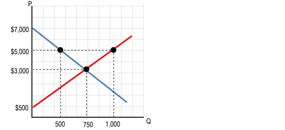
Alright, let's do this example. The graph below represents the market for funky fresh rhymes. So, at a price of $3,000 per funky fresh rhyme, what is the producer surplus? Right. So we dealt with this graph with consumer surplus. Now we're talking about producer surplus. Okay? So how do we see what the producer surplus is in this case? Remember, producer surplus is going to be the area below the market price and above the supply curve, okay? So what is our market price here? $3,000 right here, right? So what's the area below the $3,000? It's going to be everything here, but above the supply curve right so we're going to stop when we reach the supply curve and that's going to be our producer surplus in this case is that triangle right. So we need to find the area of this triangle. If you remember, the area of a triangle is going to be half times base times height. Right? Half bh. So we need to find what the base is and what the height is, and then we can calculate this. So I tend to always put my base on the up-down axis. It doesn't really matter which one you call base, which one you call height, you'll get the same answer. So that's our base and our height there. Right? So let's go ahead and see how do we calculate the base. Well, the base is going to be this length right and it doesn't go all the way down to the bottom. It only goes up it stops at that 500 point, right, so it goes from 500 up to 3,000. So we need the distance between that and we're going to get half times so the base is going to be the difference of those two, right? 3,000 minus 500. That's going to give us the length of this. 3,000 minus 500 is the length of the base there, and let's do the same thing with height. What do we see with height? Well, it starts at 0 so we're not going to have a subtraction here. It starts all the way at 0 and it goes to this point 750. So the height is just going to be 750 in this case times 750. Alright. So we've got all our numbers. We just got to do some quick arithmetic and we'll have our area which is our Producer surplus. So half ×2,500×750. So our area is going to be let me do some quick math in my head. It's going to be 937,500 right. I did that all in my head real quick. I'm just kidding, but the idea here is right we'll do that math half ×2,500×750 and that is our producer surplus right. 937,500 and that is here at a price of $3,000 producer surplus. A $937,500. Cool. Let's move on to the next problem.
Use the graph for funky-fresh rhymes above. If a shift in demand causes equilibrium price to increase from $3,000 to $5,000 per funky-fresh rhyme, what is the change to producer surplus?