Table of contents
- 1. Introduction to Anatomy & Physiology5h 43m
- What is Anatomy & Physiology?22m
- Levels of Organization13m
- Variation in Anatomy & Physiology12m
- Introduction to Organ Systems27m
- Homeostasis10m
- Feedback Loops11m
- Feedback Loops: Negative Feedback19m
- Feedback Loops: Positive Feedback11m
- Anatomical Position7m
- Introduction to Directional Terms3m
- Directional Terms: Up and Down9m
- Directional Terms: Front and Back6m
- Directional Terms: Body Sides12m
- Directional Terms: Limbs6m
- Directional Terms: Depth Within the Body4m
- Introduction to Anatomical Terms for Body Regions3m
- Anatomical Terms for the Head and Neck8m
- Anatomical Terms for the Front of the Trunk8m
- Anatomical Terms for the Back9m
- Anatomical Terms for the Arm and Hand9m
- Anatomical Terms for the Leg and Foot15m
- Review- Using Anatomical Terms and Directions12m
- Abdominopelvic Quadrants and Regions19m
- Anatomical Planes & Sections17m
- Organization of the Body: Body Cavities13m
- Organization of the Body: Serous Membranes14m
- Organization of the Body: Serous Membrane Locations8m
- Organization of the Body: Thoracic Cavity8m
- Organization of the Body: Abdominopelvic Cavity12m
- 2. Cell Chemistry & Cell Components12h 36m
- Atoms- Smallest Unit of Matter57m
- Isotopes37m
- Introduction to Chemical Bonding19m
- Covalent Bonds40m
- Noncovalent Bonds5m
- Ionic Bonding37m
- Hydrogen Bonding19m
- Introduction to Water7m
- Properties of Water- Cohesion and Adhesion7m
- Properties of Water- Density8m
- Properties of Water- Thermal14m
- Properties of Water- The Universal Solvent17m
- Acids and Bases12m
- pH Scale21m
- Carbon8m
- Functional Groups9m
- Introduction to Biomolecules2m
- Monomers & Polymers11m
- Carbohydrates23m
- Proteins28m
- Nucleic Acids34m
- Lipids28m
- Microscopes11m
- Prokaryotic & Eukaryotic Cells26m
- Introduction to Eukaryotic Organelles14m
- Endomembrane System: Protein Secretion30m
- Endomembrane System: Digestive Organelles14m
- Mitochondria & Chloroplasts21m
- Endosymbiotic Theory10m
- Introduction to the Cytoskeleton11m
- Cell Junctions8m
- Biological Membranes11m
- Types of Membrane Proteins8m
- Concentration Gradients and Diffusion9m
- Introduction to Membrane Transport16m
- Passive vs. Active Transport14m
- Osmosis30m
- Simple and Facilitated Diffusion17m
- Active Transport30m
- Endocytosis and Exocytosis15m
- 3. Energy & Cell Processes10h 8m
- Introduction to Energy15m
- Laws of Thermodynamics15m
- Chemical Reactions9m
- ATP22m
- Enzymes14m
- Enzyme Activation Energy9m
- Enzyme Binding Factors9m
- Enzyme Inhibition10m
- Introduction to Metabolism8m
- Redox Reactions15m
- Introduction to Cellular Respiration22m
- Types of Phosphorylation14m
- Glycolysis19m
- Pyruvate Oxidation8m
- Krebs Cycle16m
- Electron Transport Chain10m
- Chemiosmosis7m
- Review of Aerobic Cellular Respiration19m
- Fermentation & Anaerobic Respiration23m
- Introduction to Cell Division22m
- Organization of DNA in the Cell17m
- Introduction to the Cell Cycle7m
- Interphase18m
- Phases of Mitosis48m
- Cytokinesis16m
- Cell Cycle Regulation18m
- Review of the Cell Cycle7m
- Cancer13m
- Introduction to DNA Replication22m
- DNA Repair8m
- Central Dogma7m
- Introduction to Transcription20m
- Steps of Transcription19m
- Genetic Code25m
- Introduction to Translation30m
- Steps of Translation23m
- Post-Translational Modification6m
- 4. Tissues & Histology10h 3m
- Introduction to Tissues & Histology16m
- Introduction to Epithelial Tissue24m
- Characteristics of Epithelial Tissue37m
- Structural Naming of Epithelial Tissue19m
- Simple Epithelial Tissues1h 2m
- Stratified Epithelial Tissues55m
- Identifying Types of Epithelial Tissue32m
- Glandular Epithelial Tissue26m
- Introduction to Connective Tissue36m
- Classes of Connective Tissue8m
- Introduction to Connective Tissue Proper40m
- Connective Tissue Proper: Loose Connective Tissue56m
- Connective Tissue Proper: Dense Connective Tissue49m
- Specialized Connective Tissue: Cartilage44m
- Specialized Connective Tissue: Bone12m
- Specialized Connective Tissue: Blood9m
- Introduction to Muscle Tissue7m
- Types of Muscle Tissue45m
- Introduction to Nervous Tissue8m
- Nervous Tissue: The Neuron8m
- 5. Integumentary System2h 28m
- 6. Bones & Skeletal Tissue2h 16m
- An Introduction to Bone and Skeletal Tissue18m
- Gross Anatomy of Bone: Compact and Spongy Bone7m
- Gross Anatomy of Bone: Periosteum and Endosteum11m
- Gross Anatomy of Bone: Bone Marrow8m
- Gross Anatomy of Bone: Short, Flat, and Irregular Bones5m
- Gross Anatomy of Bones - Structure of a Long Bone23m
- Microscopic Anatomy of Bones - Bone Matrix9m
- Microscopic Anatomy of Bones - Bone Cells25m
- Microscopic Anatomy of Bones - The Osteon17m
- Microscopic Anatomy of Bones - Trabeculae9m
- 7. The Skeletal System2h 35m
- 8. Joints2h 17m
- 9. Muscle Tissue2h 33m
- 10. Muscles1h 11m
- 11. Nervous Tissue and Nervous System1h 35m
- 12. The Central Nervous System1h 6m
- 13. The Peripheral Nervous System1h 26m
- Introduction to the Peripheral Nervous System5m
- Organization of Sensory Pathways16m
- Introduction to Sensory Receptors5m
- Sensory Receptor Classification by Modality6m
- Sensory Receptor Classification by Location8m
- Proprioceptors7m
- Adaptation of Sensory Receptors8m
- Introduction to Reflex Arcs13m
- Reflex Arcs15m
- 14. The Autonomic Nervous System1h 38m
- 15. The Special Senses2h 41m
- 16. The Endocrine System2h 47m
- 17. The Blood3h 22m
- 18. The Heart3h 42m
- 19. The Blood Vessels3h 35m
- 20. The Lymphatic System3h 16m
- 21. The Immune System14h 33m
- Introduction to the Immune System10m
- Introduction to Innate Immunity17m
- Introduction to First-Line Defenses5m
- Physical Barriers in First-Line Defenses: Skin13m
- Physical Barriers in First-Line Defenses: Mucous Membrane9m
- First-Line Defenses: Chemical Barriers24m
- First-Line Defenses: Normal Microbiota7m
- Introduction to Cells of the Immune System15m
- Cells of the Immune System: Granulocytes28m
- Cells of the Immune System: Agranulocytes26m
- Introduction to Cell Communication5m
- Cell Communication: Surface Receptors & Adhesion Molecules16m
- Cell Communication: Cytokines24m
- Pattern Recognition Receptors (PRRs)48m
- Introduction to the Complement System24m
- Activation Pathways of the Complement System23m
- Effects of the Complement System23m
- Review of the Complement System13m
- Phagocytosis17m
- Introduction to Inflammation18m
- Steps of the Inflammatory Response28m
- Fever8m
- Interferon Response25m
- Review Map of Innate Immunity
- Introduction to Adaptive Immunity32m
- Antigens12m
- Introduction to T Lymphocytes38m
- Major Histocompatibility Complex Molecules20m
- Activation of T Lymphocytes21m
- Functions of T Lymphocytes25m
- Review of Cytotoxic vs Helper T Cells13m
- Introduction to B Lymphocytes27m
- Antibodies14m
- Classes of Antibodies35m
- Outcomes of Antibody Binding to Antigen15m
- T Dependent & T Independent Antigens21m
- Clonal Selection20m
- Antibody Class Switching17m
- Affinity Maturation14m
- Primary and Secondary Response of Adaptive Immunity21m
- Immune Tolerance28m
- Regulatory T Cells10m
- Natural Killer Cells16m
- Review of Adaptive Immunity25m
- 22. The Respiratory System3h 20m
- 23. The Digestive System3h 5m
- 24. Metabolism and Nutrition4h 0m
- Essential Amino Acids5m
- Lipid Vitamins19m
- Cellular Respiration: Redox Reactions15m
- Introduction to Cellular Respiration22m
- Cellular Respiration: Types of Phosphorylation14m
- Cellular Respiration: Glycolysis19m
- Cellular Respiration: Pyruvate Oxidation8m
- Cellular Respiration: Krebs Cycle16m
- Cellular Respiration: Electron Transport Chain14m
- Cellular Respiration: Chemiosmosis7m
- Review of Aerobic Cellular Respiration18m
- Fermentation & Anaerobic Respiration23m
- Gluconeogenesis16m
- Fatty Acid Oxidation20m
- Amino Acid Oxidation17m
- 25. The Urinary System2h 39m
- 26. Fluid and Electrolyte Balance, Acid Base Balance37m
- 27. The Reproductive System2h 5m
- 28. Human Development1h 21m
- 29. Heredity3h 32m
15. The Special Senses
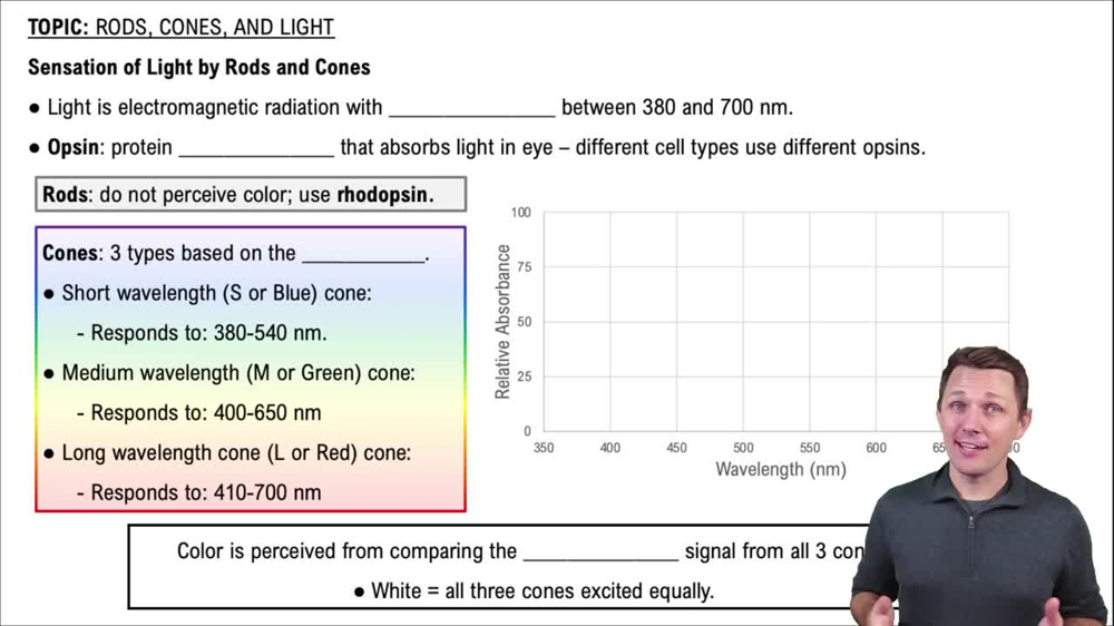
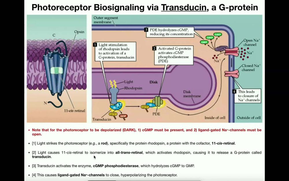
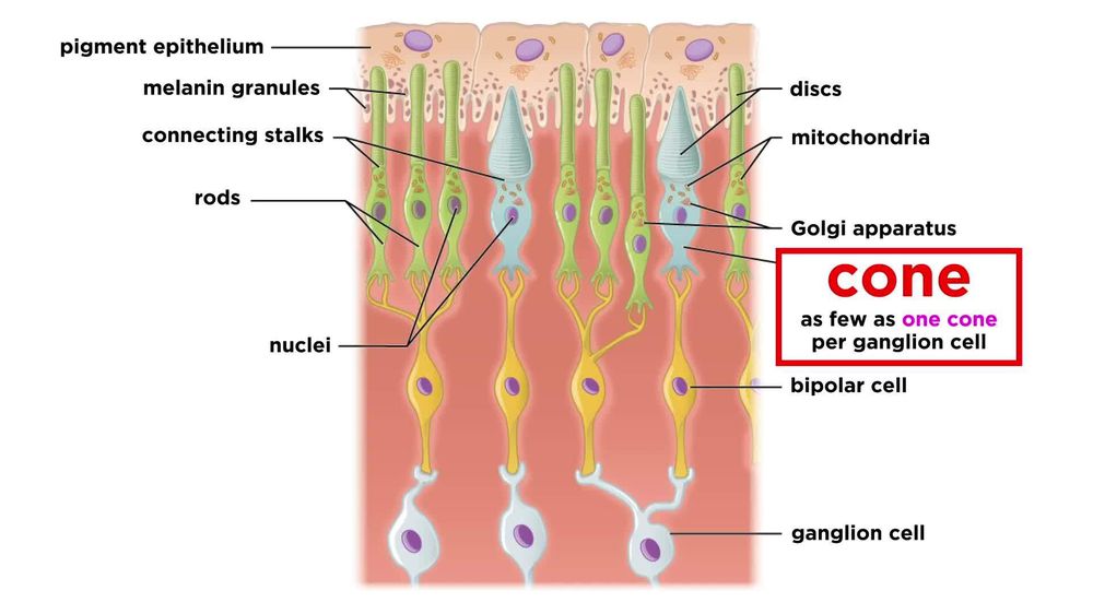
Rods, Cones, and Light


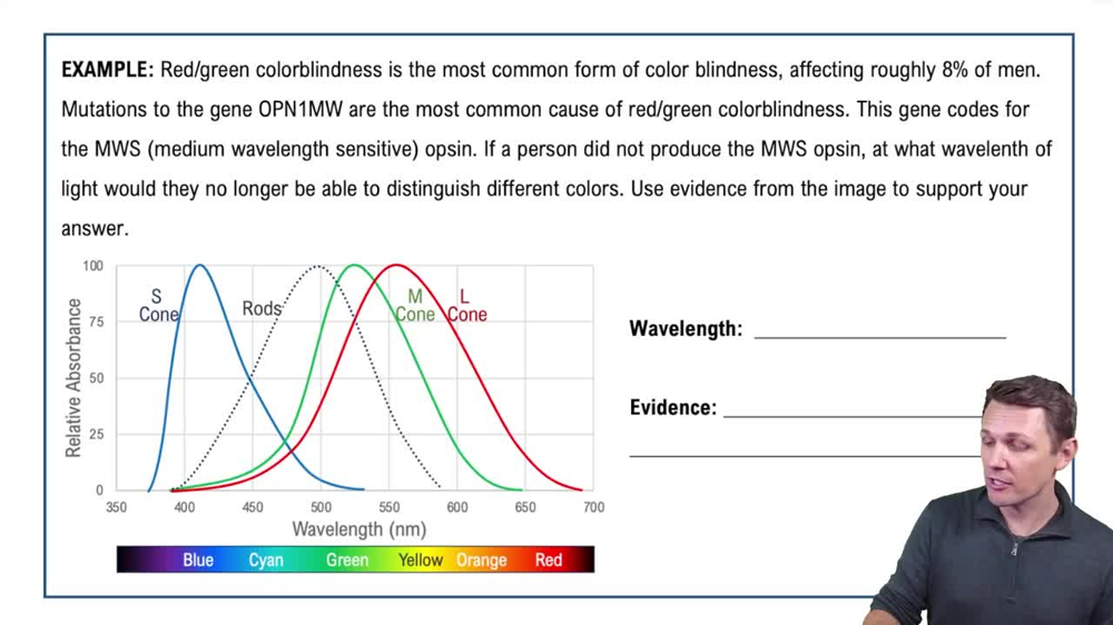
Rods, Cones, and Light Example 1
Bruce Bryan
Video duration:
4mPlay a video:
Related Videos
Related Practice
 15:34
15:34